The ServiceRocket logo in Raisin Black is our primary logo colors, and should only be used in applications that it appears legible, such as on a white or light background color. On dark colors, use the reversed text.
DOWNLOAD LOGOS
Corona Yellow is our main brand color and should be used in whatever you create.
Corona can be used with any other brand color to add dimension, depth, and contrast. Pale Corona and Medium Corona are used in Corona’s place for large fills and backgrounds.
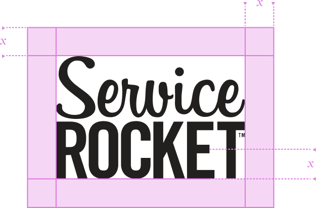
This is the minimum spacing requiredaround the Wordmark to provide adequate breathing room.
In most cases more space is suitable for to optimize a layout.
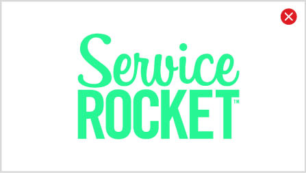
- Change the color of the logo.
- Squash the logo.
- Stretch the logo.
- Outline the logo.
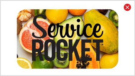
- Fill the logo with images.
- Place the logo over a busy background.
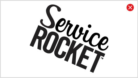
- Skew the logo.
- Fill the logo with gradients.
- Change the logo’s spacing or proportions.


We know we just say NOT to use a logo over busy images.
But we know there are times when you really need to do it.
Here we give you some guidelines and examples of when it is acceptable to use the logo over an image.
Make sure to use the highest contrast for the logo color. this means use the black version of the logo on lighter images and the white version on dark images.
Make sure the logo is placed in a relatively empty space so that it stands out.